Case Study: Building a Responsive Rich Text Editor at Understory
My internship at Understory has been an intensive and insightful experience, combining frontend development, UX/UI design, agile methodologies, and team collaboration. This case study focuses on the development of a Markdown Editor, which evolved into a central feature within Understory’s “Create Experience Flow.”
The editor initially appeared to be a relatively simple component but proved to be technically and conceptually complex, especially when considering responsive behavior and mobile user experience. This case study explores the technical decisions, design iterations, and learnings from building a mobile-friendly, scalable, and user-centric rich text editing component.
🧠 Background: About Understory and “The Rule of Gray”
Understory is a digital platform designed to help experience-based businesses (so-called “experience makers”) manage, promote, and sell their events, courses, and guided experiences. The platform includes features like booking management, calendar views, dashboards, and other administrative tools.
Internally, the team uses a principle known as “The Rule of Gray”—inspired by Gray, the founder of Copenhagen Cooking Class. Gray represents the platform’s core user: a passionate creator who juggles multiple responsibilities daily and expects tools to be intuitive, reliable, and efficient.
This principle underpins all design and development: if something feels confusing or inefficient to the developer or designer, it will likely be the same for the user. It became a guiding philosophy during the Markdown Editor’s development.
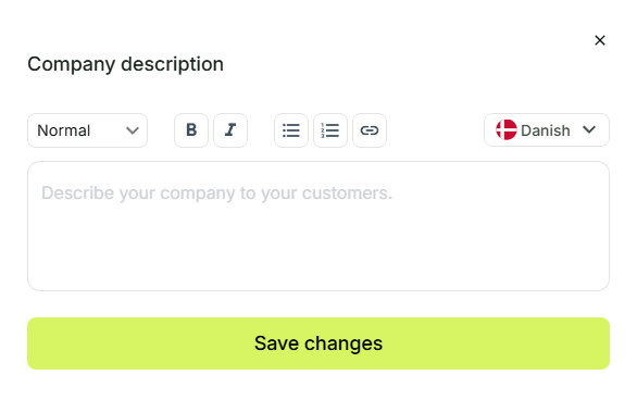
🎯 Objective
Design and implement a rich text editing experience that:
- Supports Markdown syntax
- Works across desktop and mobile devices
- Provides a native-like editing feel
- Is modular and extensible for future features
- Balances technical constraints with usability
🔍 Problem Framing
The original Markdown Editor was implemented as a modal optimized for desktop. However, user analytics revealed that:
- Over 40% of users accessed the editor via mobile
- 60% of users began creating experiences on a mobile device
This highlighted a significant mismatch between the editor’s design and real user behavior. The original implementation lacked responsive behavior and created friction for mobile-first users.
🛠️ Technical and Design Challenges
1. Keyboard and Toolbar Conflict (Mobile)
One major challenge was managing screen real estate on mobile. Attempting to place the formatting toolbar above the on-screen keyboard consumed up to 60% of the viewport, leading to a poor editing experience.
2. Native vs. Web Limitations
Creating a native-like text editing experience in a browser context was difficult due to platform limitations. Fine-grained control over cursor position, toolbar behavior, and soft keyboard interactions proved tricky and required multiple iterations.
3. Touch Optimization
The editor needed to support touch-friendly controls without sacrificing editing precision or Markdown clarity. This required careful UX research, usability testing, and iteration of button hit areas, text selection behavior, and contextual menus.
🚧 Iterative Improvements
Through multiple cycles of research, prototyping, and testing, the following improvements were made:
- Toolbar redesign: Dynamic positioning based on viewport and keyboard state
- Responsive layout: Fully adaptive UI for small, medium, and large screens
- Mobile-focused interaction models: Larger tap targets, minimized modals
- Graceful fallback for unsupported Markdown features on older mobile browsers
🔄 Lessons Learned
💡 UX Is Contextual
What works on desktop often fails on mobile. The editor had to adapt to multiple input models (touch, keyboard, hybrid), screen sizes, and usage patterns.
💡 Complexity Emerges Gradually
Even seemingly small features—like text formatting—can trigger unexpected technical depth, especially when embedded in a live product used daily by real users.
💡 Feedback Loops Matter
Rapid user feedback (e.g., via internal QA and user testing) allowed the team to identify pain points early and focus development efforts efficiently.
🧩 Tools and Technologies Used
- React – Component-based editor interface
- TypeScript – Type safety and maintainable architecture
- Zod – Input validation schemas
- GitHub PRs – Code review and version control
- Figma Dev Mode – Bridging design and development
- Postman – API testing and integration
- Slack & Linear – Team communication and project tracking
✅ Outcomes
- A mobile-optimized, flexible Markdown Editor that aligns with Understory’s UX principles
- Stronger cross-team alignment between developers and designers
- A design and development workflow that balances technical constraints with human-centered design
📈 Reflection
The Markdown Editor journey served as a microcosm of product development at scale: managing competing priorities, dealing with legacy constraints, and adapting to real-world user behavior. It also reinforced the importance of:
- Designing with empathy
- Working iteratively and collaboratively
- Staying open to feedback and continuous improvement
This project not only improved a core feature in the product but also helped solidify my skills in frontend architecture, UX thinking, and responsive interface design.